
Monk Colors
How the walk for peace by Buddhist monks sparked inspiration

I’ve been following a small group of monks on Instagram travel slowly across the United States, treating their walk as a meditation for peace. They move quietly through cities, towns, and long stretches of road, believing that being present, intentional, and compassionate can answer division and turmoil. Each day, their journey is an example of mindfulness in action—they accept tough conditions, unpredictable weather, and uncertainty as part of their practice. Along their path, they encourage moments of reflection for those they meet, showing that peace comes from everyday actions, patience, and caring for others.
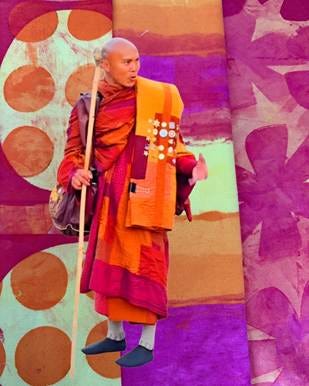
If you check out the monks on their walk for peace, you’ll probably notice their simple, traditional robes. As someone who loves color and fabric, I can’t help but be drawn to the soft, earthy shades they wear—saffron, ochre, brown, gray, and sometimes a gentle maroon. These colors aren’t chosen just for looks; they each have a story.
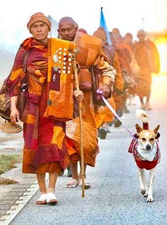
Saffron and ochre, for instance, stand for giving up material things, which feel both peaceful and powerful. The earth tones make me think of being connected to nature—grounded and calm. Their robes are loose and layered, making it easy to walk for miles and deal with whatever weather comes their way. These colors and simple styles quietly signal kindness and equality, reminding me that what matters most is compassion and caring for one another
The monks’ peaceful journey has deeply influenced my creative process in the studio. Motivated by their example, I dedicated several days to dyeing fabric, intentionally choosing to work with a limited palette of three colors. This approach is guided by both practical and aesthetic considerations.
Printing fabric with thickened dyes is a process in which fiber reactive dyes are thickened with print paste and applied to fabric through screens or stencils, allowing for controlled patterns, rich color, and expressive surface design.
When printing fabric with thickened dyes, I use a variety of tools—screens, stencils, and scrapers—to guide the dye through open areas and apply it directly onto the surface. I let the dye rest on the fabric for a while, which gives me crisp, well-defined edges and allows me to layer colors for added visual dimension.
This method lets me create subtle textural effects and achieve deep color saturation, along with natural variations in tone and intensity. Each time I apply the dye, my unique gesture is recorded in the fabric—the pressure I use, the movement of my hand, and the rhythm I maintain all shape the outcome. As a result, every piece of printed fabric tells its own distinct story, reflecting my individuality and intention throughout the process.
By restricting myself to three colors, I can efficiently use all the dye, which is more economical and reduces waste. This strategy also simplifies the dyeing process, especially during the washing stage. Because all the fabrics are dyed in the same colors, washing them out—three times in cold, cold, and hot water—prevents the colors from bleeding into one another.
I chose a palette of warm hues—Yellow Orange, Yellow, and Fuchsia—to help me develop a cohesive color scheme. This approach keeps me from overworking a design or ending up with muddy colors. By layering dyes thoughtfully and carefully adjusting the amount of print paste I use, I’m able to create a wide range of color values and intensities. The fabrics I’ve produced as a result have a unified, harmonious look that feels intentional and balanced.
To create unique patterns for my printed fabrics, I hand-cut a variety of stencils. The designs I selected are simple, directly inspired by my observations of the monks on their journey. Rather than using a single color or a formal, organized pattern, their robes feature squares, rectangles, and wide strips of color. This organic approach to color arrangement influenced my own creative choices.
I have adopted a deliberately streamlined printing process, restricting myself to only a few screens, each featuring an uncomplicated motif: squares, thick stripes, flower shape, circles. A particular aspect that drew my attention was the meticulously arranged rows of badges displayed and worn by monks on their robes. These badges are presented to them by various community groups encountered along their route inspired print rows of circles that are used in several fabrics.
Although it may seem unlikely for anyone to associate my hand-dyed fabrics with the monks walking for peace, the connection is meaningful to me. While I recognize that the physical act of walking for peace may not directly create peace, I believe the intention behind it travels far beyond the immediate action. This reflects the spiritual concept of the butterfly effect: even the smallest intention, action, or thought possesses energy that ripples outward, influencing people and situations in ways I may never witness.
A quiet moment of kindness, a mindful decision, or a compassionate response can move through others, subtly shaping the world beyond my immediate reach. Spiritually, this understanding reminds me that nothing is insignificant. My inner state matters, and small, conscious acts can contribute to a larger unfolding—bringing about connection, balance, and change in the world.
Until Next Time……
Margaret
Love your chosen color palette and meaning behind it. I look forward to seeing this project when completed.
Beautiful colors and story.