


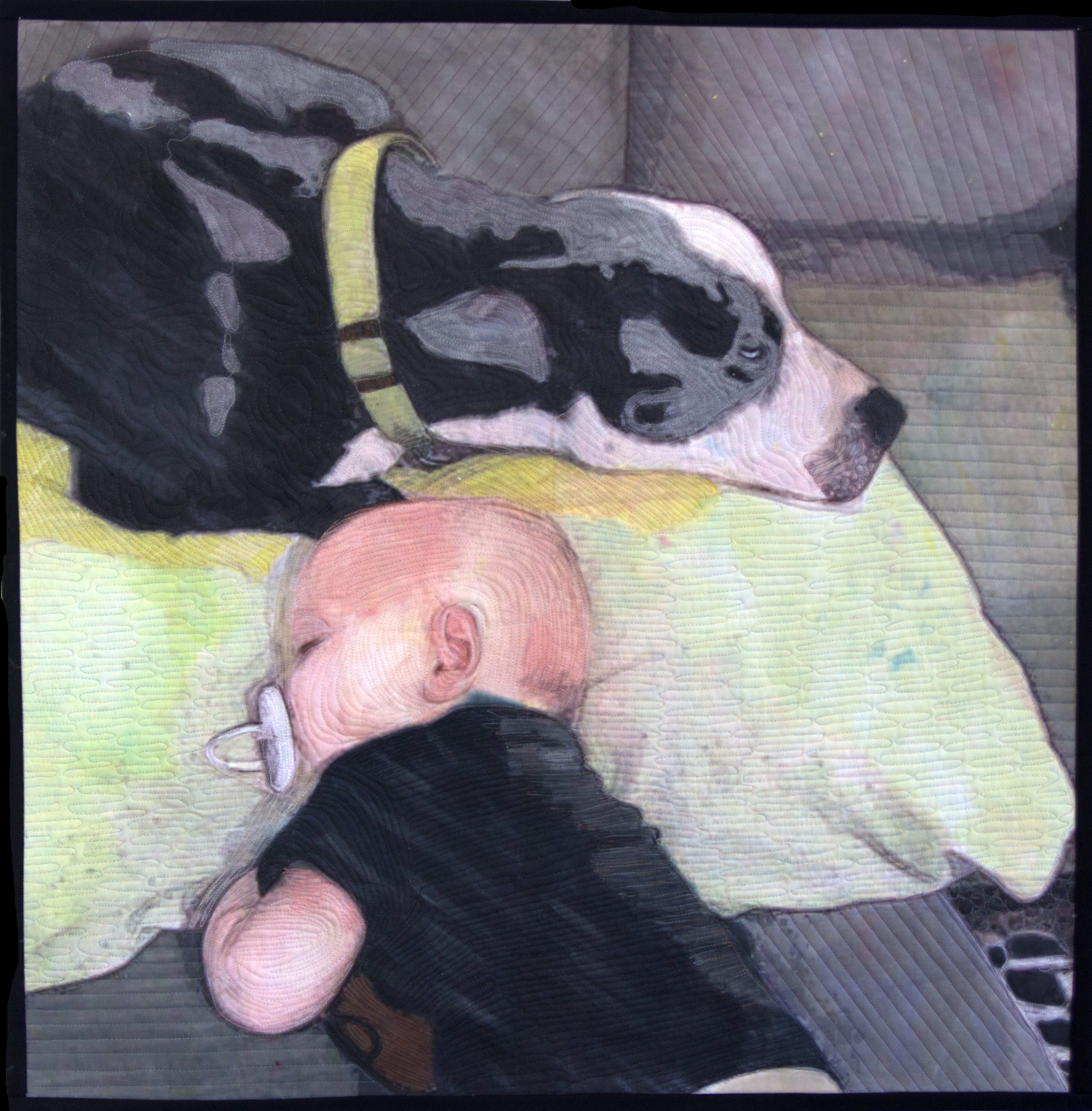
I write this on a sleepy hot Memorial Day. It’s a quiet day spent on the patio looking over the recent additions to my small garden. The cat naps with one eye open for hummingbirds at the feeder or lizards climbing up the wall. It’s no wonder that today I am selecting “Nap Time” as the subject for the backstory.
Although the subject matter is obviously depicting quiet, the subject matter was not what sparked the project. I was making a departure from a successful compositional formula.
The formula was:
Front facing or profile figure
Visually engaging background
Vibrant color
As an artist, I have been drawn to creating a visual problem and working out a solution through a series of compositional structures. This process probably goes back to my career as a teacher developing units and lesson plans within the unit that would lead the students to increased knowledge in the visual arts. The short form is, imagine what you want to create and then experiment until you arrive at your ideal, or at least at a new understanding.
I made the decision to eliminate every component that I was attached to in my previous body of work. When I selected this photograph it was on my phone. At that point my grandson, the subject, was no longer a baby. As any grandparent knows, our phones have a nice collection of images from various stages of grandkids lives to show off. This one caught my eye because of the low lighting and the lack of color. The check was gray, his dog black and white, and his pale skin.
I downloaded it to the computer where it sat in my future projects folder. Periodically I would play with composition, particularly the values.
The most notable painting I know of which explores values in a portrait is “Arrangement in Grey and Black (Number 1)” by the American Painter James Whistler. Most people know this iconic painting by the name “Whistler’s Mother”. From my perspective the popular title does not help the audience see into the mind of the artist. In fact it misses the point. Whistler was challenging the establishment.
Whistler painted this in 1871 in London. He entered the painting into the 104th Exhibition of the Academy of Arts. It nearly was rejected, until the Academy changed the title to “Arrangement in Grey and Black: Portrait of the Artist’s Mother”. Whistler was furious. He vowed to never exhibit with the Academy again.

Whistler was expressing an attitude toward art for arts sake that was ahead of his time. It wouldn’t be until a century later that Ad Reinhardt made his series of large black paintings that explored the subtle variations of values within a single hue. Whistler’s painting, like the minimalists of the 1960's, was large; 57” x 64”. He was painting a figure but his purpose was to explore the possibilities of a single color, just as Reinhardt had. The difference was Reinhardt was embraced by the art world.


After the exhibition Whistler painted a second Arrangement in Black and Grey (Number 2) of the Victorian author and philosopher Thomas Carlyle. This time the title Arrangement in Black and Gray without a reference to the subject remained. The Number 2 was added to distinguish it from the first painting.
In 1890 Whistler wrote in his book The Gentle Art of Making Enemies
Take the picture of my mother, exhibited at the Royal Academy as an "Arrangement in Grey and Black." Now that is what it is. To me it is interesting as a picture of my mother; but what can or ought the public to care about the identity of the portrait?
The painting was eventually acquired in 1891 by Paris's Musée du Luxembourg, which delighted the artist.
Removing color and working with value is not, as one might assume; easier. In fact it is more challenging. My process involves a photograph, digital manipulation, printing, painting, and stitching which creates a surface texture. After cropping and moving the frame around the subjects, I began by trying to digitally create my own arrangement in black and gray.
I avoid using true black. As an art teacher I used to warn my students “Black is a dangerous color.” I even took the black out of watercolors and tempera sets to prevent the inevitable disaster paintings. As a painter, I taught my students to use color compliments to create grays; mixing violet with yellow, or blue with orange.
The process has become intuitive for me. The challenge is to figure out what I did to create a specific gray and how to duplicate that value. When I am working with a very thin acrylic paint and water soluable mediea that dries quickly and absorbs into unprimed canvas, I do not have the luxury that Whistler did of mixing a palette of oil paints that can be used for an extended period of time.
Like Whistler, I did not use gray for the subject's skin tone. Instead I recreated his pale skin and I added a bit of light using a wash of yellow. This gave the composition a the energy it needed.
Because I was working with minimal elements, I extended this approach to my quilting with gray thread and straight lines in much of the composition. It was a departure of my usual method of dense contour quilting, a process of line drawing with thread over the surface.
Jennie Jones, a contemporary African American minimalist artist living in Brooklyn describes perfectly the beauty in paring down the elements of a composition. It creates a balance.
“There is a poetic nature to minimalism that is about striking a balance between full and empty.”
I am sure I will return to this process of creating something new by reducing the elements within a composition. The idea intrigues me. Maybe when the garden is no longer in bloom and colder temperatures become the norm, my work will also take a turn into a new season.
Until next time….
Love this - I feel like I just took an art history class. It helps me 'see' your piece so much more clearly. From chilly but green Montana, xoxoxo.