


The Art Critic
Finding insight from Utahs Art Magazine 15Bytes

I am an avid reader of an online Utah arts magazine called 15 Bytes. I discovered it a couple of years ago on Instagram. Traditional landscapes, photographs of the local scenery, and western art dominated what I saw in public spaces. The support for our local museum was modest. There were just a couple of commercial galleries and some spaces for local guilds. So I wrote off the visual arts in Utah and pursued exhibitions out of state.
When I started reading 15 Bytes I realized that I was misinformed. Utah has a very lively visual arts community. The magazine offers articles reviewing visual arts, literary arts and dance in the State of Utah. It was established in 2001 and offers both artists and art lovers an extensive overview of the art scene. Their contributors are academics or professional writers and experts in their subject matter. The critiques of current exhibitions in both museums and private galleries highlight the depth of contemporary art in the state.

To my surprise, my work was recently reviewed by one of my favorite critics; Geoff Wichert. Mr. Wichert objects to the term critic. He would rather be thought of as an advocate on behalf of those he writes about. Although he shies away from the term, he is a critic in the best sense of the term.
When I looked up the definition of a critic there were two descriptions. The first was “a person who expresses an unfavorable opinion of something”. Often the critic is characterized as a snob or bully who looks down on those people or the work they are judging.
The second definition of a critic is a person who judges the merits of literary, artistic, or musical works, especially one who does so professionally. This critic provides the creative and the audience with insights. They are a bridge of understanding between an audience and the art.
Mr. Wichert has mentioned my work twice in previous articles. Once in an juried exhibition sponsored by the American Association of University Women. He wrote “Some fabric works risk not being recognized due to their successful encroachment on territory reserved for classic media. Margaret Abramshe’s “Warrior” could easily be taken for an impasto if not viewed closely enough to see the stitching, which contributes to the monumental feel of her head.”
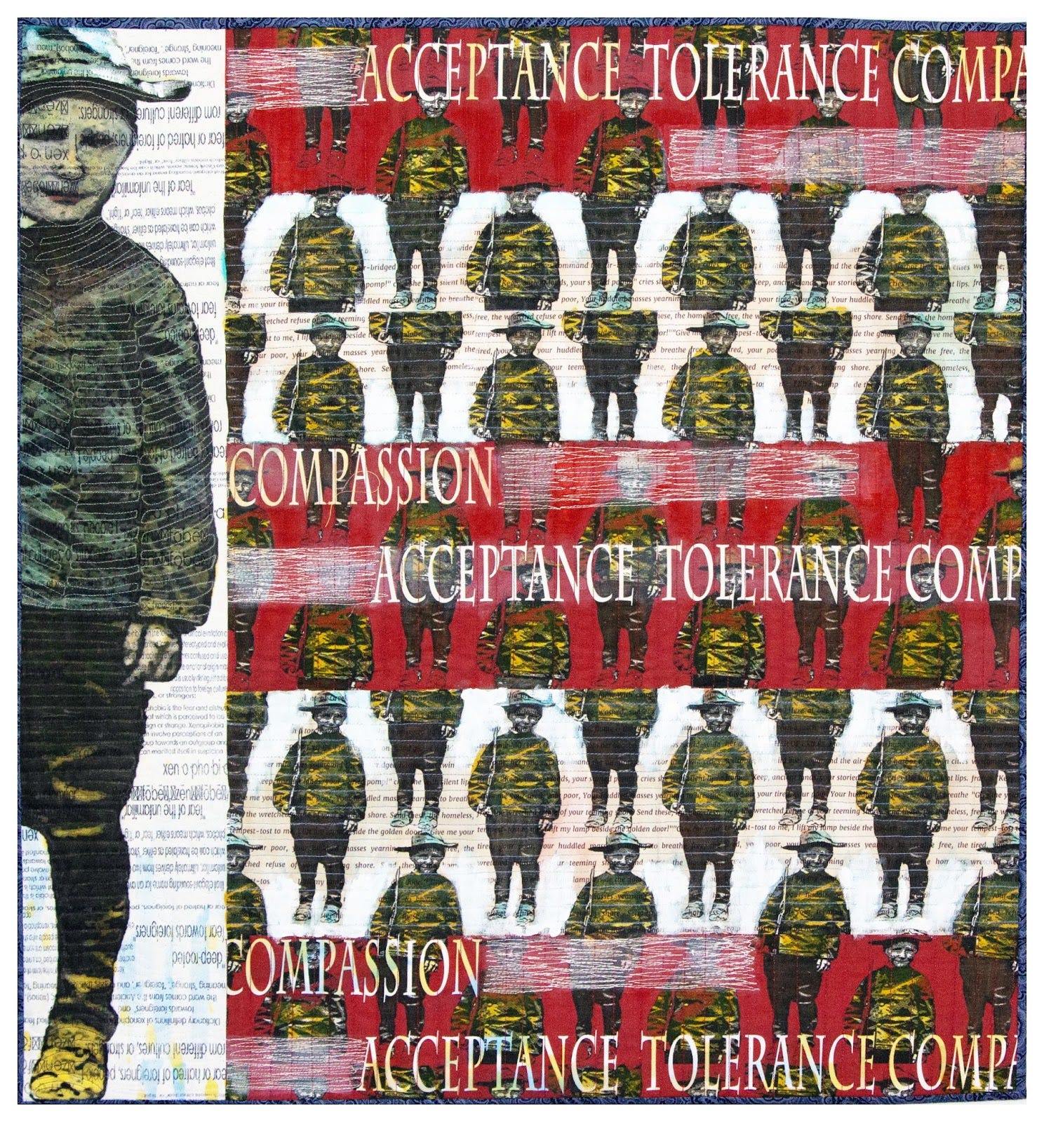
A second mention was my inclusion in the Statewide Annual Exhibition. He wrote “Margaret Abramshe’s Army of Compassion places Emma Lazarus’s “New Colossus” alongside a discussion of “xen-o-pho-bi-a.”
As I read his introduction I realized the importance of the statement I had submitted. It was valuable insight for me as an artist who was told previously by a member of the art quilt community to focus my statements on technique. I have ignored that advice and often just include a single line about my technique and focus the statement on the rationale for the submission.
Gazing over the 60 works in the 48th Statewide Annual at Bountiful Davis Art Center, juror Joseph Ostraff says that given the high quality of submissions to be expected in Utah, the 328 works offered to BCAC could easily have yielded a second 60, and several more after that. His criteria for those he ultimately chose, however, were two. While encountering each piece, he read the artists’ statements, seeking what he calls, in his own statement, “the relationship between intention and outcomes.”
In the latest article I was one of three artists highlighted in a review of the Springville Museums Salon. It’s one of the important exhibitions in the state and very competitive. I was happy to be included in the previous Salon which marked the 100th year of the exhibition. There were over two thousand entries with only 250 works accepted. This year I submitted two pieces and had one accepted. (The piece not accepted sold quickly in a private sale)
“At Springville, Craft and Fine Art Weave Together Seamlessly” was an article featuring the work of three textile artists written by Geoff Wichert. One is a weaver named Sara Luna. (She is amazing.) Her portraits were accurately described as “large, monochromatic, startlingly illusionistic weavings have been hanging very much like paintings.” Wichert has mentioned Sara previously and sees her as a rising star in Utah’s art community.

Bianca Velasquez’s beadwork on canvas was also featured. He noted the struggle I and many art quilters experience. “Photography diminishes her art, turning 200 hours of hand-beading, done over a year on a canvas almost as tall as the artist, into a thumbnail so crowded the details may get lost.”
My submission was hung alone in a main gallery just inside the front hall. It was well lit and in a place that every visitor would pass. The museum is large with several galleries and halls that are filled with work. The review of my work was in a substantial paragraph.

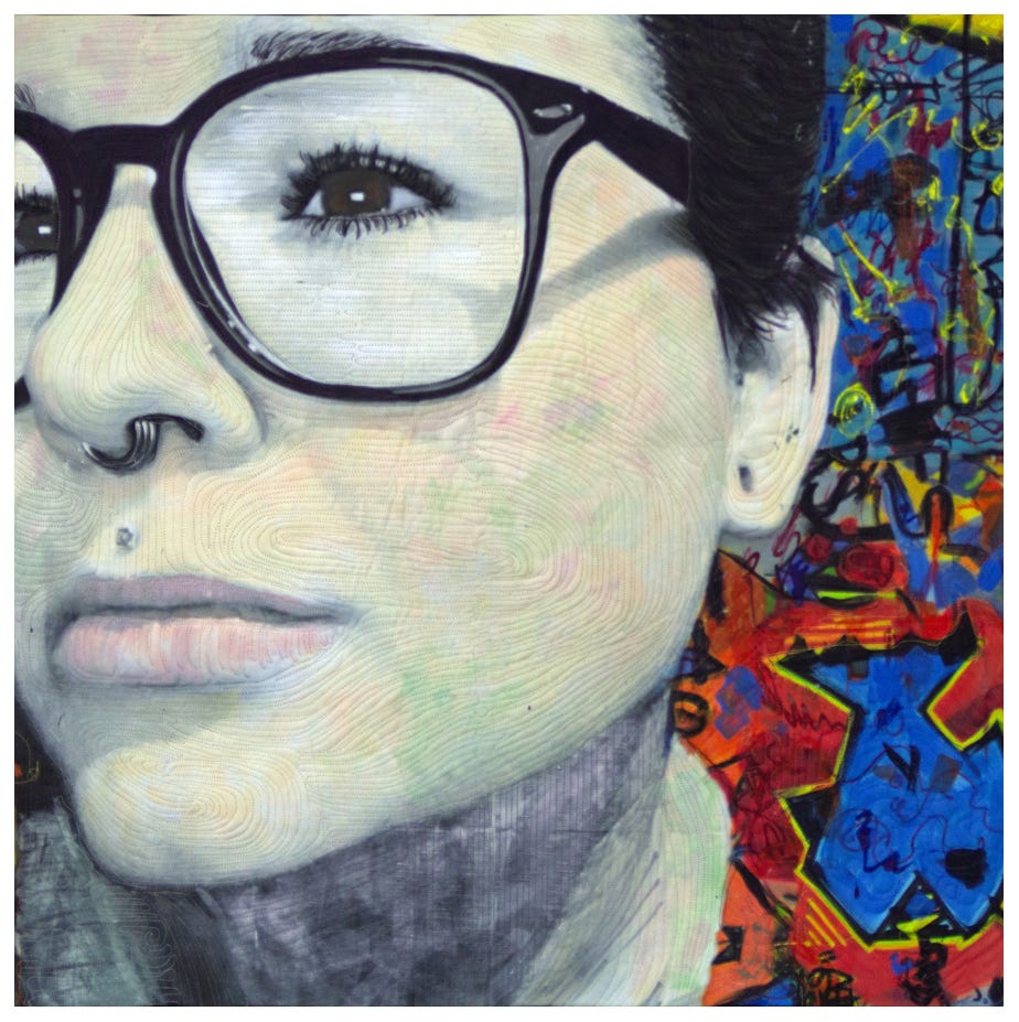
“The Reader,” a painting on fabric that uses a technique she appears to have invented. She engages in what she calls “a conversation with history” on the topic of issues faced by women, as revealed in photographs she found in the collection of the Library of Congress.”
“Abramshe turns a chosen image into a painting on linen cotton canvas, then drafts contours and patterns over it with multicolored stitching. The color-matched thread as much as disappears into the painting, leaving behind a surface reminiscent of impasto paint application or bas relief. As is often the case with exploratory techniques, the result should be seen in person. Across a gallery or from a moderate distance, the subtle-but-elaborately three-dimensional surface seems animated in a way that draws the viewer in for a closer look.”

Mr. Wichert mentioned something that had not occurred to me. I had invented my technique. He called my process exploratory. I had to think about that for a few days. It occurred to me that in the art quilt world there are people who print whole cloth compositions and quilt them. There are people who paint with thickened dyes. There are people who collage over a photograph printed on fabric. But I don’t know anyone who, like me; makes a digital composition, prints it with the intention of painting the entire surface to alter the print.
Having come from the artworld not the quilting world; I found the commercial printing’s color on fabric to be flat. The colors and the color values were never right. If composition was “off” I didn’t want to reprint so I painted in or over the surface.
It took time to figure out how to apply layers of thin water soluable to the surace and get the result I wanted. After a period of time I designed my digital compositions as first steps. After printing the fabric began the second step of painting. Sometimes I actual leave the background blank or reduce the colors to grayscale like under painting. The third step is using stitching as a method of reworking the contours of the figures or objects and changing the surface.
I’ver chosen a new path. I no longer enter many art quilt juried exhibitions. I don’t enter quilt shows. I don’t teach this technique because it’s something I can’t deconstruct into a formula. As the critic pointed out I continue to invent and work in an exploratory process.
Until Next Time…..
Margaret
Leading the way!