


What about scale?
Scale is the size, but proportion is more important

Scale vs Proportion
In art, scale refers to the size of an object in relation to other objects or to a specific reference point, like the human body.
Proportion: focuses on the relationship between the sizes of different parts within a single object.
The hieratic scale is used by artists as a tool for communication. The most important figure is depicted as the largest, regardless of their actual size, to emphasize their importance. In ancient Egyptian art, for instance, gods and pharaohs were often shown much larger than other figures like priests, officials, or common people. In medieval art people with more status had larger proportions than serfs.

Contemporary artist’s also play with scale. An example is the work of Lawrence and Anne Argent. They created a sculpture of a very large blue bear peering into the Denver Convention Center window. The bear's size and playful color encourage the public to see what’s happening inside that building. It now has a cult following and is a go to spot for a visitor's social media post.

Chuck Close, who died in 2021; used scale as a key element in his portraits. After leaving Yale Art School in 1964, he rejected the school’s approach to painting which was built around the theories of Joseph Albers. The emphasis was on form, structure, and design. His classmate Brice Marden, an important minimalist painter; would go on to explore those ideas for the rest of his career. Chuck Close would spend his successful career going in the opposite direction working with a genre and a method which embraced realism.
Close created a visual problem to challenge himself in his studio: Paint a duplicate of a photograph in a scale equal to or larger than abstract expressionist paintings he made at Yale. He was working in “Anti Abstraction”.
His use of scale was beyond what would be seen in a portrait gallery and separated him from those traditional painters. Combining techniques employed by both Renaissance painters and 20th-century billboard artists, he overlaid a grid on his source photograph and, over the course of four months, transposed his subject square by square to the new 9-by-7-foot canvas.

Above is a photograph of the artist in front of one of his first portraits. Later in life he had a serious brain injury which limited his mobility, but did stop him working
In the art quilt community, there is also an expectation of scale. Quilt National. The exhibition was founded in 1979. It is biannual event and considered the premiere contemporary quilt exhibition. According to ChatGPT “it has helped legitimize quilt-making as a vehicle for fine art expression. The ethos of one of founders Nancy Crowe is that scale equals importance.
Here are recent winners along with the size of their quilts. In 2025 the winner was by Shin-Hee-Chin. Her submission Viriditas was 59” x 72”. In 2023 the winner “Not Enough Time” was similar in size at 63” x 66”. In 2019 “A Conversation” by Karen Schultz measured 67” x 50”.
It is not only at Quilt National that scale is important. At Houston’s Quilt Show last year the Award for Innovative Artistry was given to “The Naughty Corner” by Tania Tanti measured 53” x 58”. The value placed on scale I believe is connected to the quilt or craft part of art quilting.
Art Quilts are often made by people who began making traditional quilts. Standard quilt sizes vary, but generally can be in consistent size ranges. By looking at work in Quilt National and at the Houston Quilt Festival I would seem that art quilters create work that measures between the size of a throw and a twin.
baby/crib (30"x40")
throw (50"x65")
twin (70"x90"),
full(85"x108")
In my own work I recently realized, or maybe grew into the idea; that the “art quilt” scale didn’t work for me. It wasn’t just the size, it was a matter of proportions. Like Chuck Close I start with a photograph which is small and I increase the size when I print my digital composition on linen cotton canvas. The max size I can print is 36” by 52”. The more I tried to make these as big as possible, the less I liked the result.
When I went to college and studied art I learned to make and stretch my own canvas to save money. I made these in standard sizes because the shop often had these on hand.
Small - 16” x 20” to 18” x 24”.
Larger - 20” x 24” and 24’ X 30”.
Big - 36” x 48”.
These are the sizes that one can find at an art store. They are intuitively right to the eye. Some of that is a proportion that relates to the figure. 4:5 (head and shoulders) 3:4 (torso) , and 2:3 for full length. They are also the proportions used in photographs.
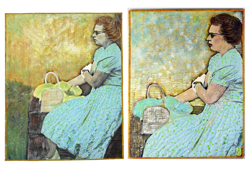
I wrote about cropping in my last post called “I think it’s done”. I explained how I improved a composition. I now realize that the proportions were off and it was something I haven’t fully considered until writing this post.
When I returned to the original photograph it looked like an 8 x 10 or a ratio of 4:5. Before cropping “Heat Wave” the size was 35” x 24”. The width was four inches of too small for a 4:5 to duplicate the ratio in the source photograph. Once cropped the size was 28” x 22” is .40 inches shy of the desired 4:5. Although I didn’t realize this until after it was finished, the proportions seemed just right to my trained eye.
Most art quilters I know don’t pay much attention to proportions. They simply use their rotary cutter to square up their quilts before binding. There is great freedom in not being limited to the size of a canvas or piece of watercolor paper. That said checking the porportions might be a trick to solve a visual problem.
It’s pretty simple. Divide the longest side by 5. Multiply that result by 4. And you will find just how far off you are to the desired ratio. You can use this with any ratio. Standard ratios include 1:1, 3:4, 4:5, 2:3.
Until Next Time…..